Saturday, 24 November 2012

Better Words For...


I know there are a lot of charts and pages out there that show lists of better words students could use in their writing, but always thought there must be a more visually pleasing way to display them out there somewhere. During my university degree we took a tutorial at Varsity Lakes School (on the Gold Coast, Australia). While there I saw a great (and colourful!) way of displaying better vocabulary for students. I have to apologise for not remembering the teachers name to give kudos but it was quite a while ago!! They were home-made and simple but very effective. Just the words cut out and glued onto coloured cardboard.
These are the ones I made- they are a bit different to the ones I originally saw. They are great for brightening up the room in a functional way :)

Also, apologies for the quality of some of the photos, the lights created a bit of glare on some of them from the angle I was taking the photo...

Better words for feelings:


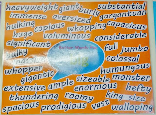
Better words for big:


Better words for happy:


Beter words for said:
 

Better words for nice:


I also made one for high modality word as we were writing persuasive texts at the time I made these:


Virtue Tree


I have seen many virtue tress in classrooms and they always look fantastic and teach the students valuable things to keep with them throughout their life. Most of the virtue trees I have seen show a tree branch with each leaf representing a different virtue.

I had a slightly different take on the traditional virtue tree and made it more of a positive reward in my classroom. I created a large tree our of brown cardboard and on each branch I wrote a different virtue. I then created a class set of leaves for each virtue. I also made each virtue a different colour to make it easier to distinguish and just to brighten up the classroom (I do love a bit of colour!).I would have loved to of backed the window with some balxk or white paper first, but as it open up into a common area I was unable to. It still stands out well in the classroom though.


At the start I introduced the virtue tree and its purpose. We then talked about different ways we could show each virtue in action (both in the classroom and outside). I paired this with a poster for each virtue (on matching colours to the leaves) that outlined some of the ways students could show each virtue. These posters were displayed on the wall beside the tree as a constant visual reminder to students.


I then explained that each time students showed a particular virtue consistently, they would be able to put their name on a leaf and add it to that virtue's branch. I did also offer a reward for students once they had their name on every branch (they received money which was part of our individual reward system at the time). The students responded really well to this concept and I often had students coming up to me after lunch breaks to tell about students displaying virtues on the playground!


I will definitely use this idea in the classroom again, I was even thinking of adapting it to introduce the class rules at the start of the year instead of virtues. Each branch could be a different class rule and by the end of term one (or even earlier I hope!), I would aim to have all studnets' names on every branch and maybe even have a whole class reward when this goal is reached. I think it would be a good visual representation of the class working together and being a team.


Here are some pictures of our virtue tree growing.... :)


Thursday, 15 November 2012

The Writing Process


I wanted to create a way to visually show my students the writing process and came up with a giant pencil! I know a lot of other teachers have used the same idea in their classrooms and I think it is really effective. I decided to add a little more information than usual to my writing process to help my students work independently (they have a tendency to ask questions they already know the answers to! This way, they have no excuse to be asking me anything, especially while I am conferencing with another child).

I also decided to add pegs with the student's names to my pencil writing process. This helps me to keep track of where students are at with just a glance, as well as being able to see which students have been 'stuck' at a certain stage for too long. This visual method also had an unexpected motivational impact as students all try not to be the last one. I always make it clear to the students how much writing I expect from them and if they get up to conferencing and have not met my expectations, they will need to go back and fix it up (which puts them back to the bottom of the conferencing list).

Anyway, here is the finished product (sorry for the mobile phone quality photo!)


Monday, 12 November 2012

Mime Classroom Display


While working in a Grade 3 classroom we began a mime unit. For young students it can be hard to isolate the different emotions and how they are shown on our faces and through our body language. To help them with this, I wanted to create a classroom display that they could refer to in order to get tips and remind them what it 'should' look like.
This is what I came up with:


I chose to represent what I considred to be the most common emotions they would need to show in their mime acting: scared, happy, sad, angry and suprised. For each emotion I displyed a list of things they should do with their faces and bodies in order to chow that emotion, as well as real life images to show them visually what they should look like.
Here is a breakdown of each one. I found all of the images on through a general web search, however it was difficult to find clear examples of scared and suprised as often they looked the same!


The instruction card in the middle says:
  • Open your eyes as wide as you can.
  • Pull your eyebrows up just a little.
  • Open your mouth and pull the edges down a little.
  • Pull your body away or make it smaller.
  • You can hold your hands in front of you or bite your fingernails.


 The instruction card in the middle says:
  • Pull the edges of your mouth up. Open your mouth to show more hapiness.
  • Pull your eyebrows up.
  • Make your eyes smaller.
  • Show energy through your body.
  • Lift your shoulders.


The instruction card in the middle says:

  • Pull the edges of your mouth down.
  • Slightly pull your eyebrows together.
  • Make your eyes a little smaller.
  • Slump your body.
  • You can put your head in your hands or loosely fold your arms.


The instruction card in the middle says:
  • Pull your eyebrows together.
  • Narrow your eyes (make them smaller).
  •  Make your mouth and lips smaller.
  • Lean your body forward.
  • You can shake your fist, put your hands on your hips or fold your arms.


The instruction card in the middle says:

  • Pull your eyebrows up as far as you can.
  • Make your eyes big (open wide).
  • Open your mouth to make an 'O' shape.
  • Move your body up and back.
  • You can move your hands to your mouth or cheeks.

I hope this has given you some ideas for your own mime display!